Class 27: More beautiful plots
Computing for Molecular Biology 1
Andrés Aravena, PhD
11 January 2021
Original plot
covid %>% filter(WHO_region=="SEARO") %>%
    filter(Date_reported>"2020-03-31", Date_reported< "2020-05-01") %>%
    ggplot(aes(x=Date_reported, y=New_cases, color=Country)) +
    geom_line()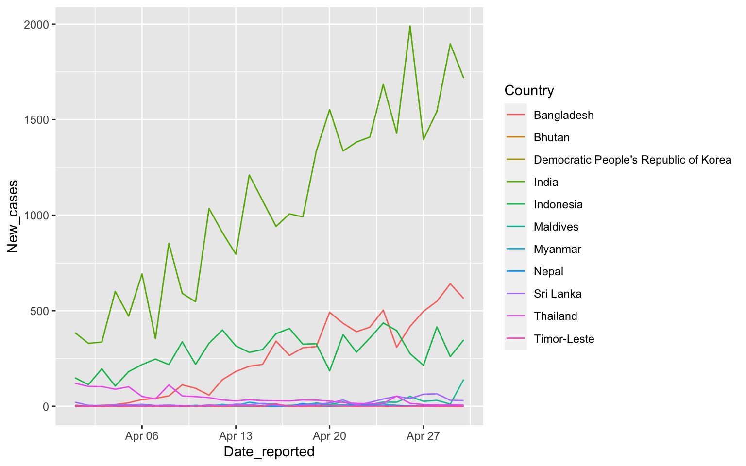
Separate facets, same y axis
covid %>% filter(WHO_region=="SEARO") %>%
    filter(Date_reported>"2020-03-31", Date_reported< "2020-05-01") %>%
    ggplot(aes(x=Date_reported, y=New_cases)) +
    facet_wrap(vars(Country), ncol=3) + geom_line()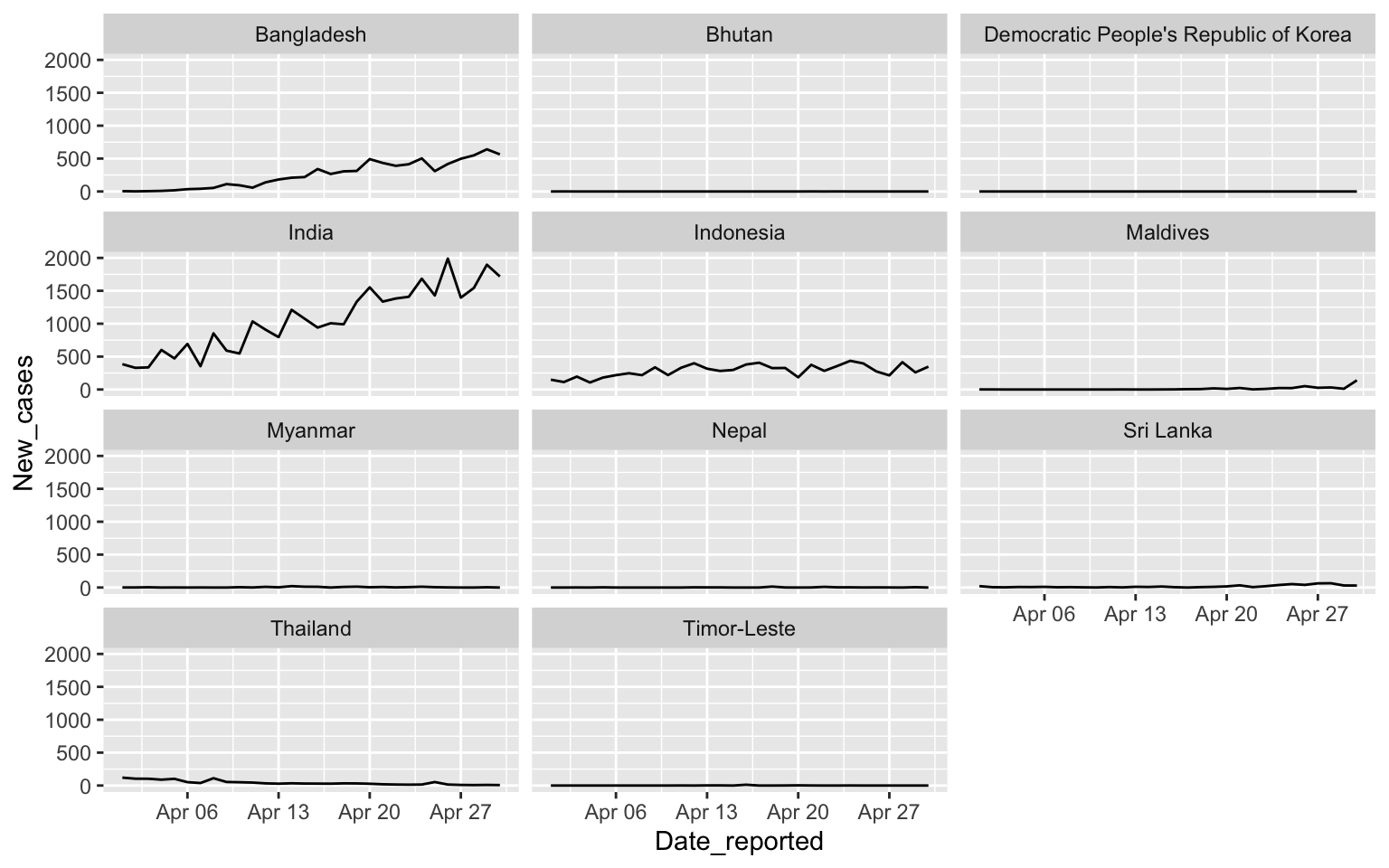
Independent y axis
covid %>% filter(WHO_region=="SEARO") %>%
    filter(Date_reported>"2020-03-31", Date_reported< "2020-05-01") %>%
    ggplot(aes(x=Date_reported, y=New_cases)) +
    facet_wrap(vars(Country), ncol=3, scales = "free_y") + geom_line()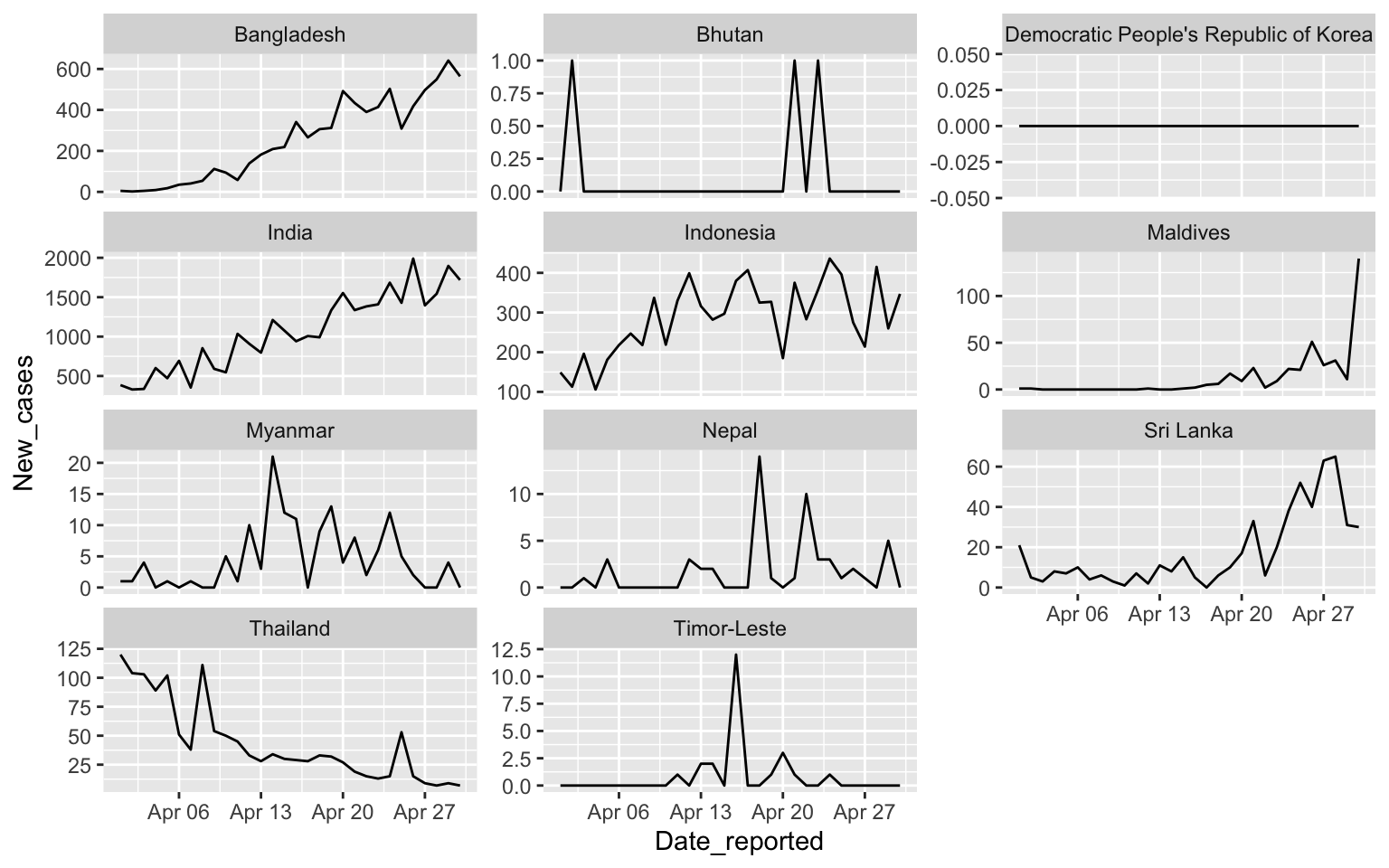
Moore’s law
ggplot(transistors, aes(x=Date, y=count)) +
    geom_point(alpha=0.5) +
    geom_line(aes(x=Date, y=predicted), color="red")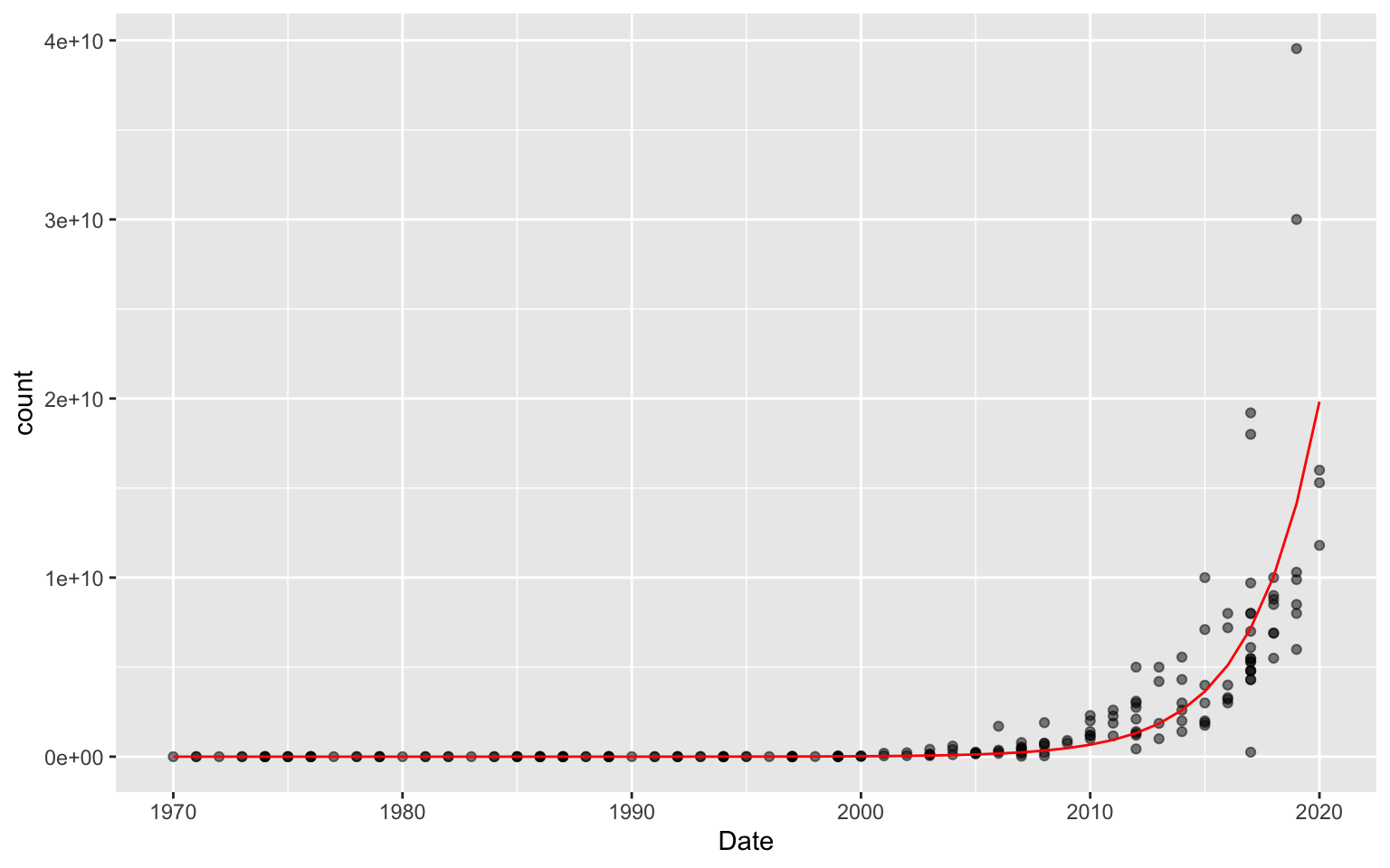
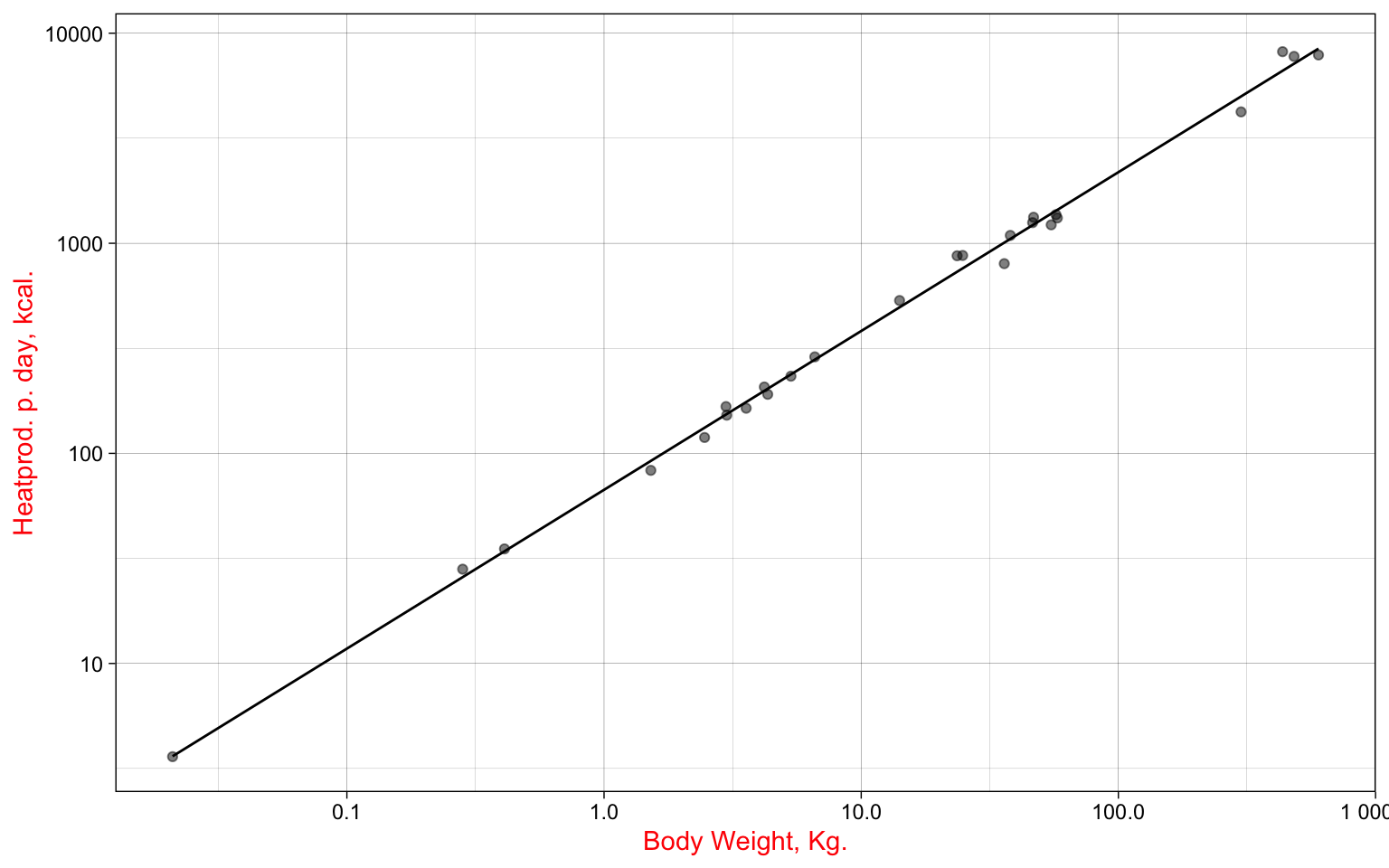
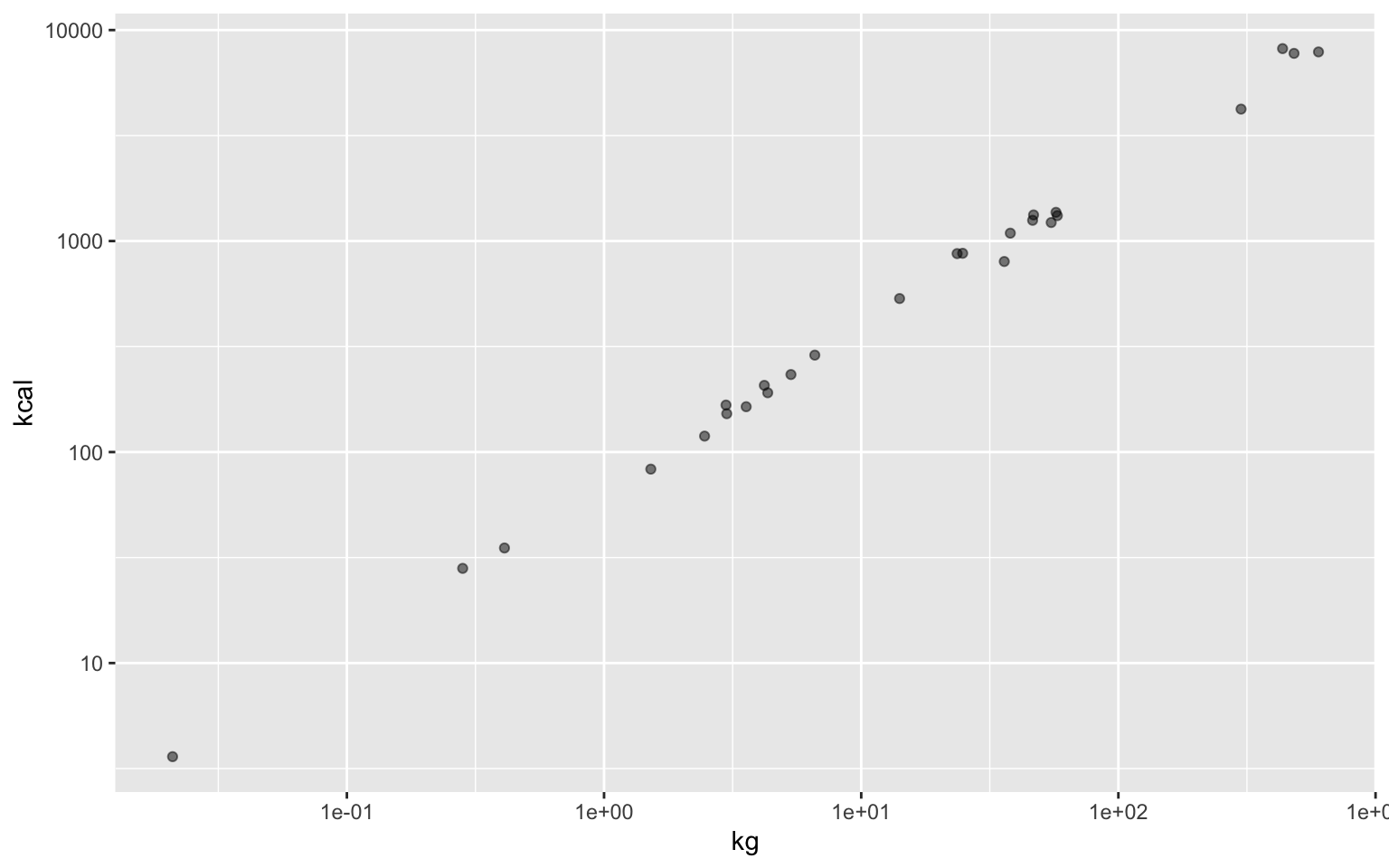
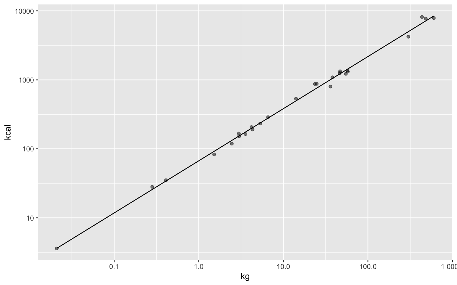
Kleiber’s law
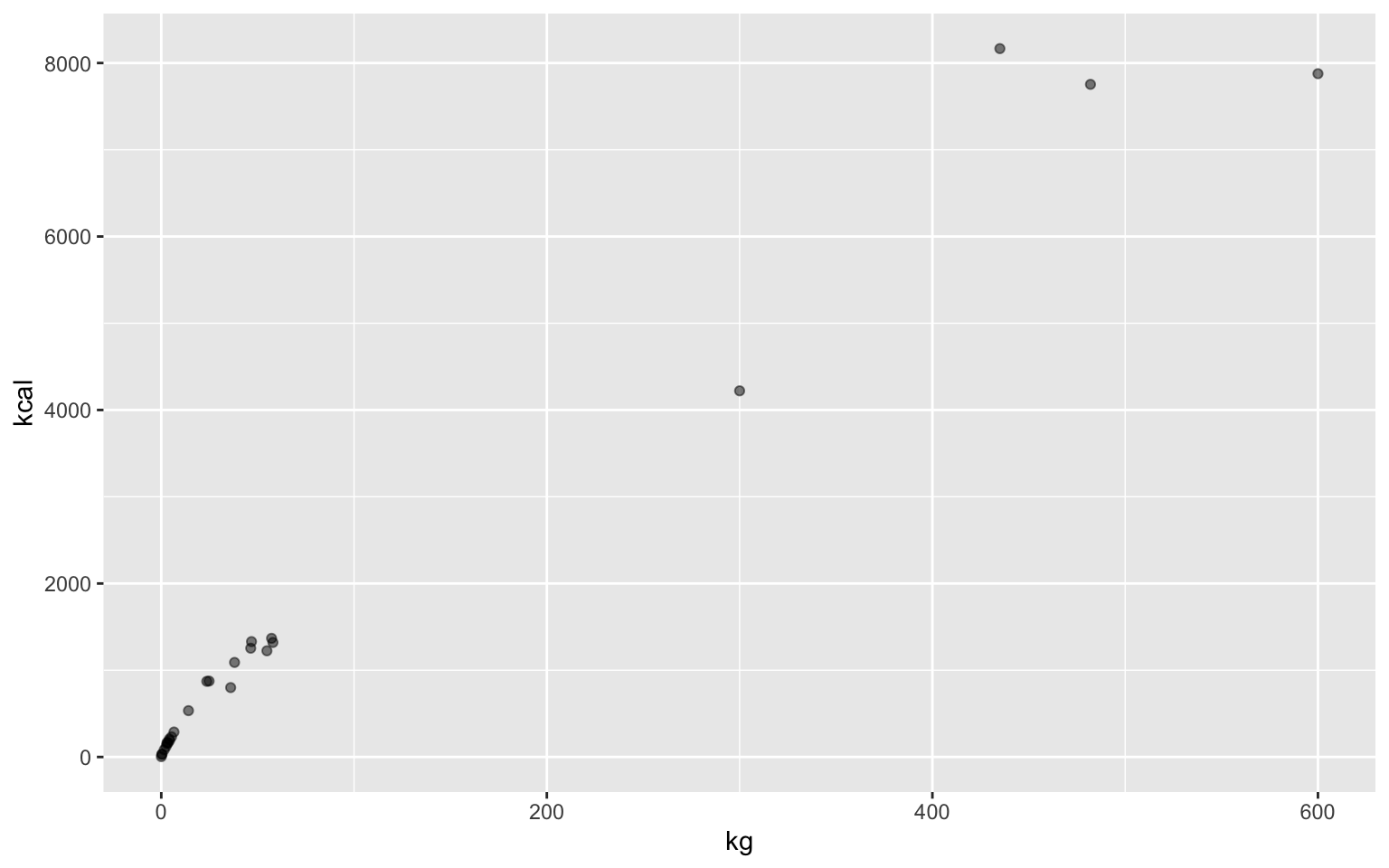
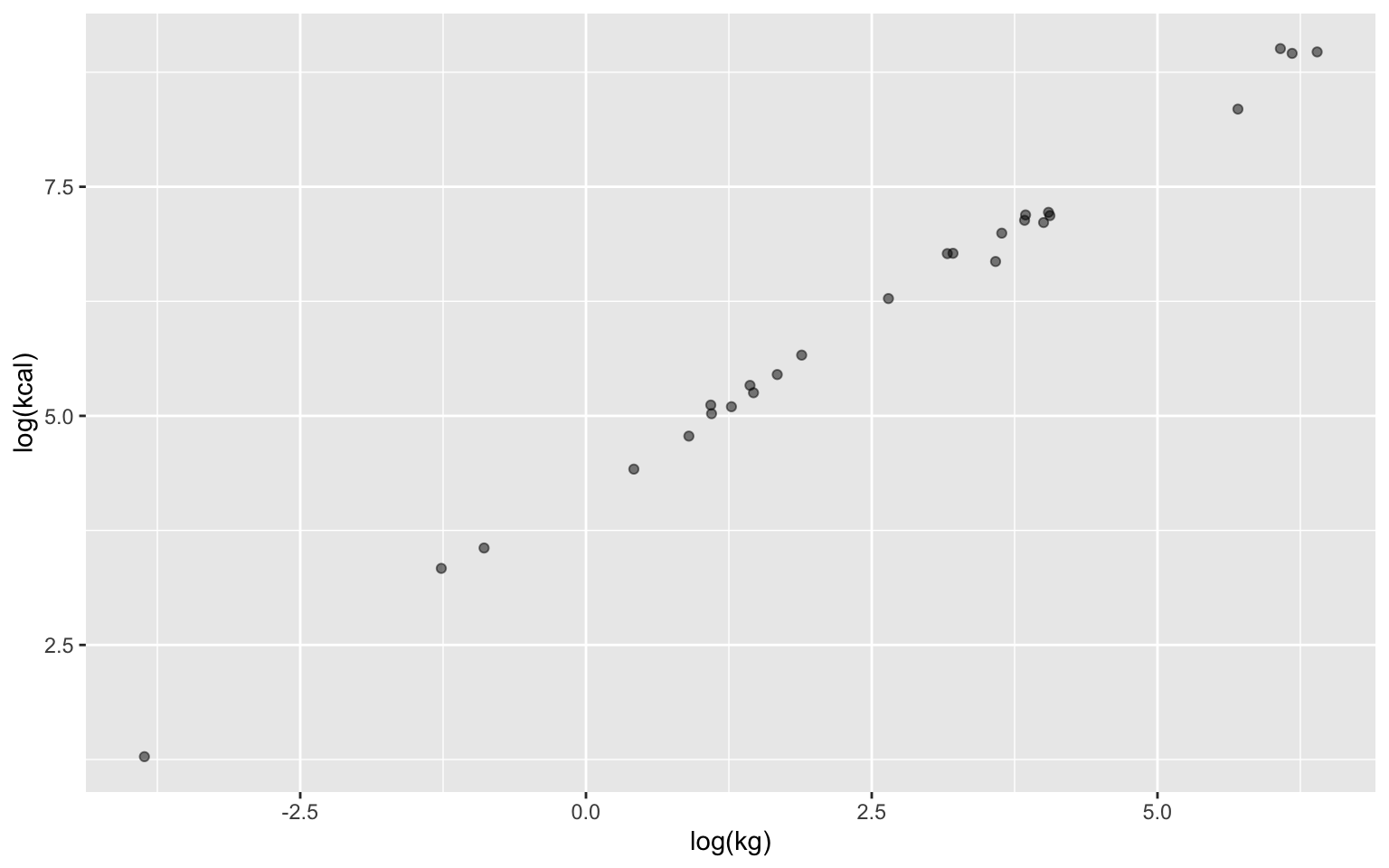
Plotting logarithms
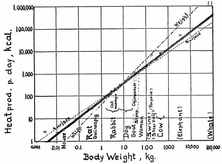
In the paper
Plotting in a logarithmic scale
To see the plot, we print() it

In most cases, we use the variable name
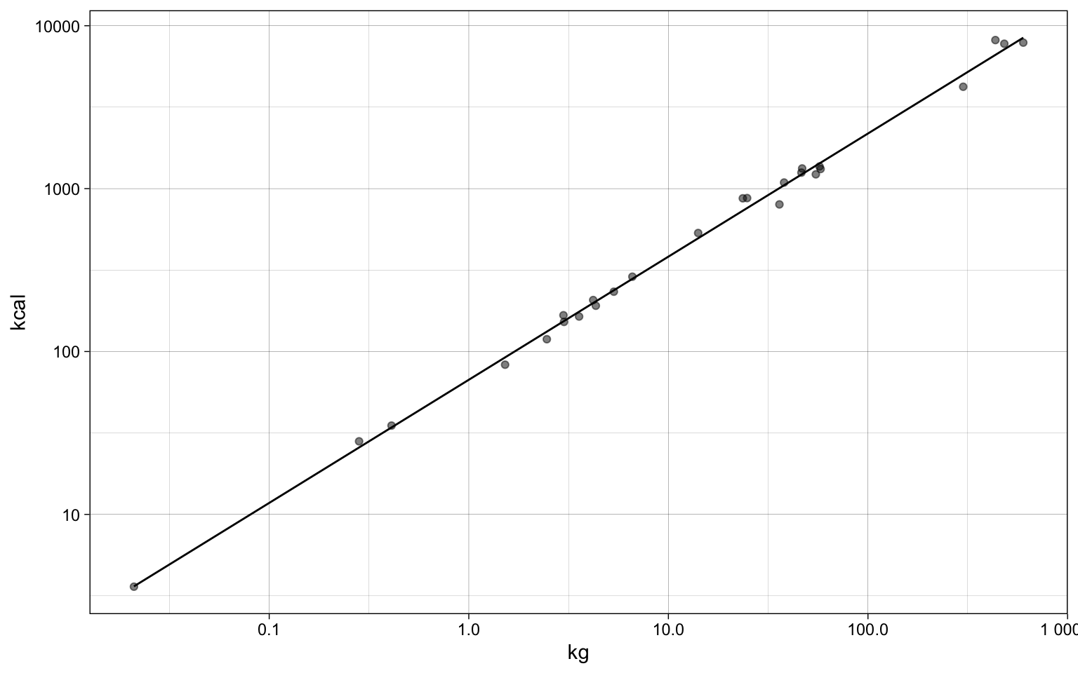
Now we can add more attributes to p
We can choose a theme for the general look
We can add labels and titles
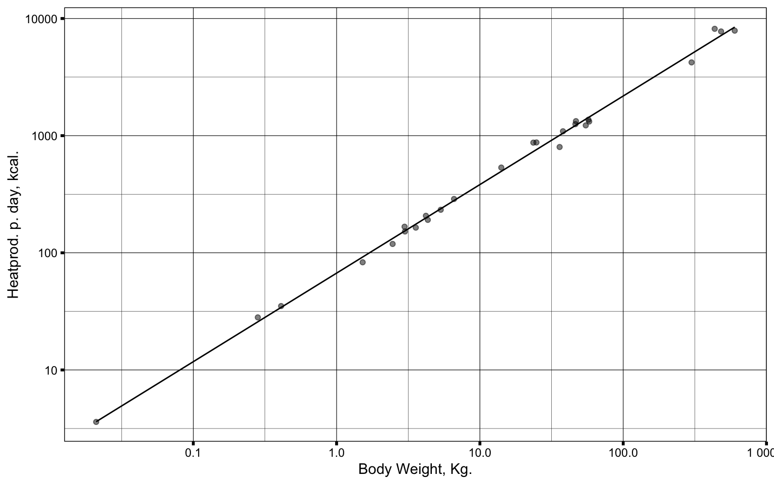
We can change the look of each part
p + theme_linedraw() + theme(axis.title = element_text(color = "red")) +
    labs(x="Body Weight, Kg.", y="Heatprod. p. day, kcal.")