Class 26: Drawing beautiful plots
Computing for Molecular Biology 1
Andrés Aravena, PhD
11 January 2021
First plot
Warning: Removed 18 rows containing missing values (geom_point).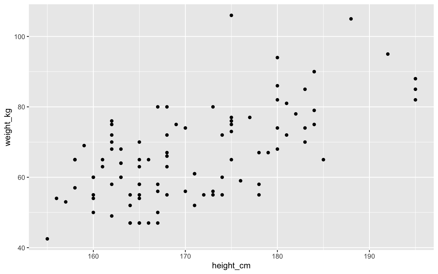
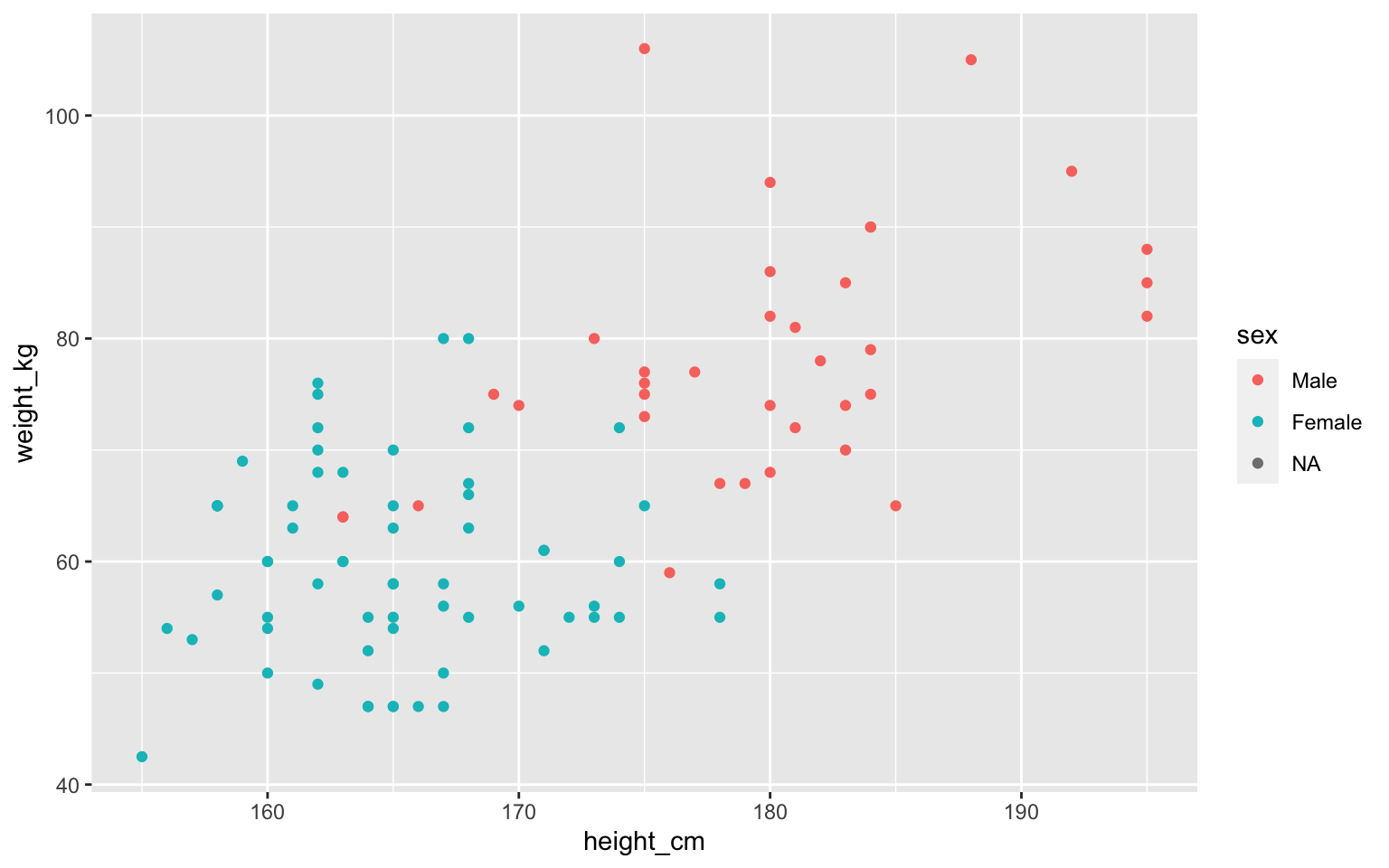
Aesthetics: how to show each column
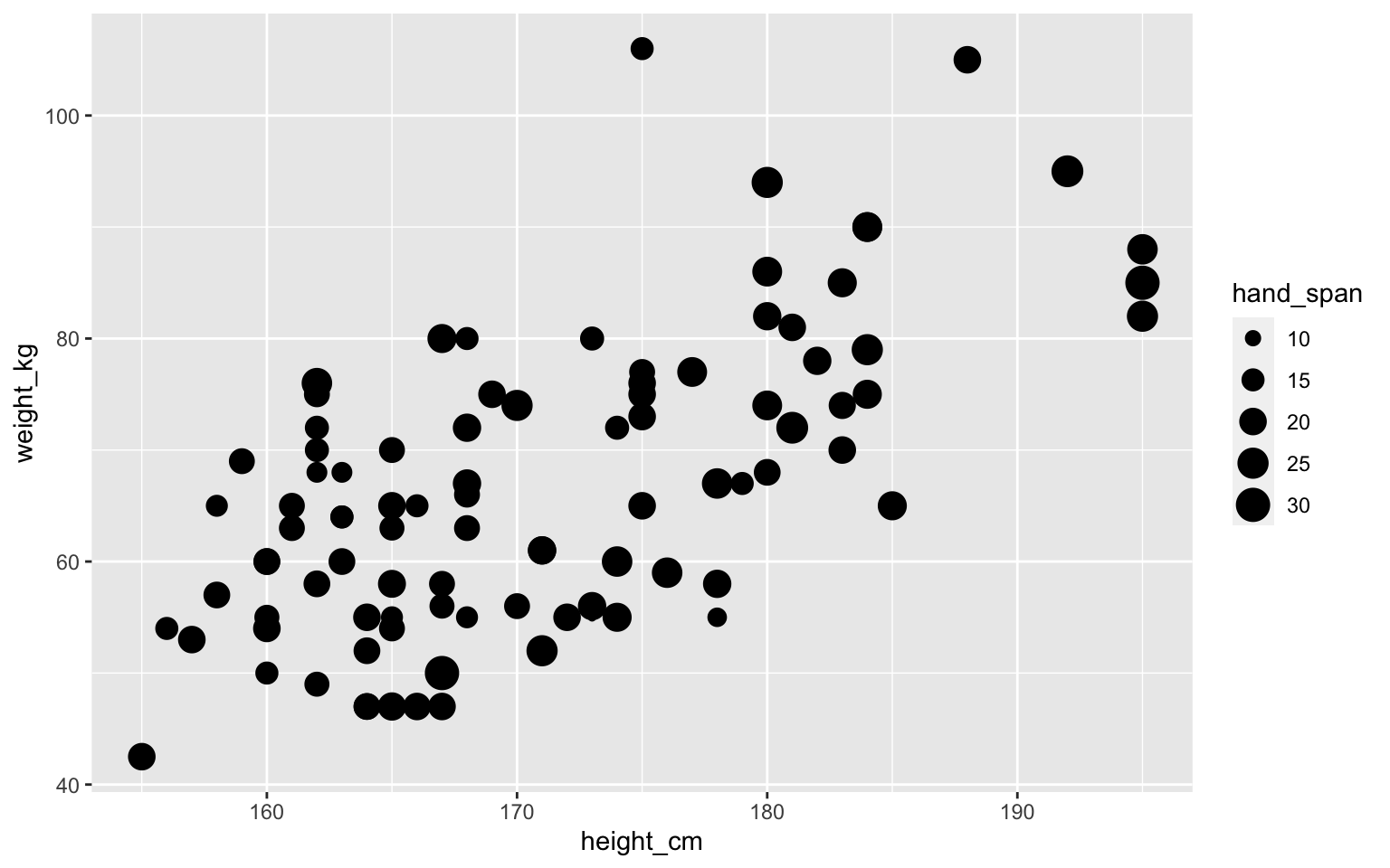
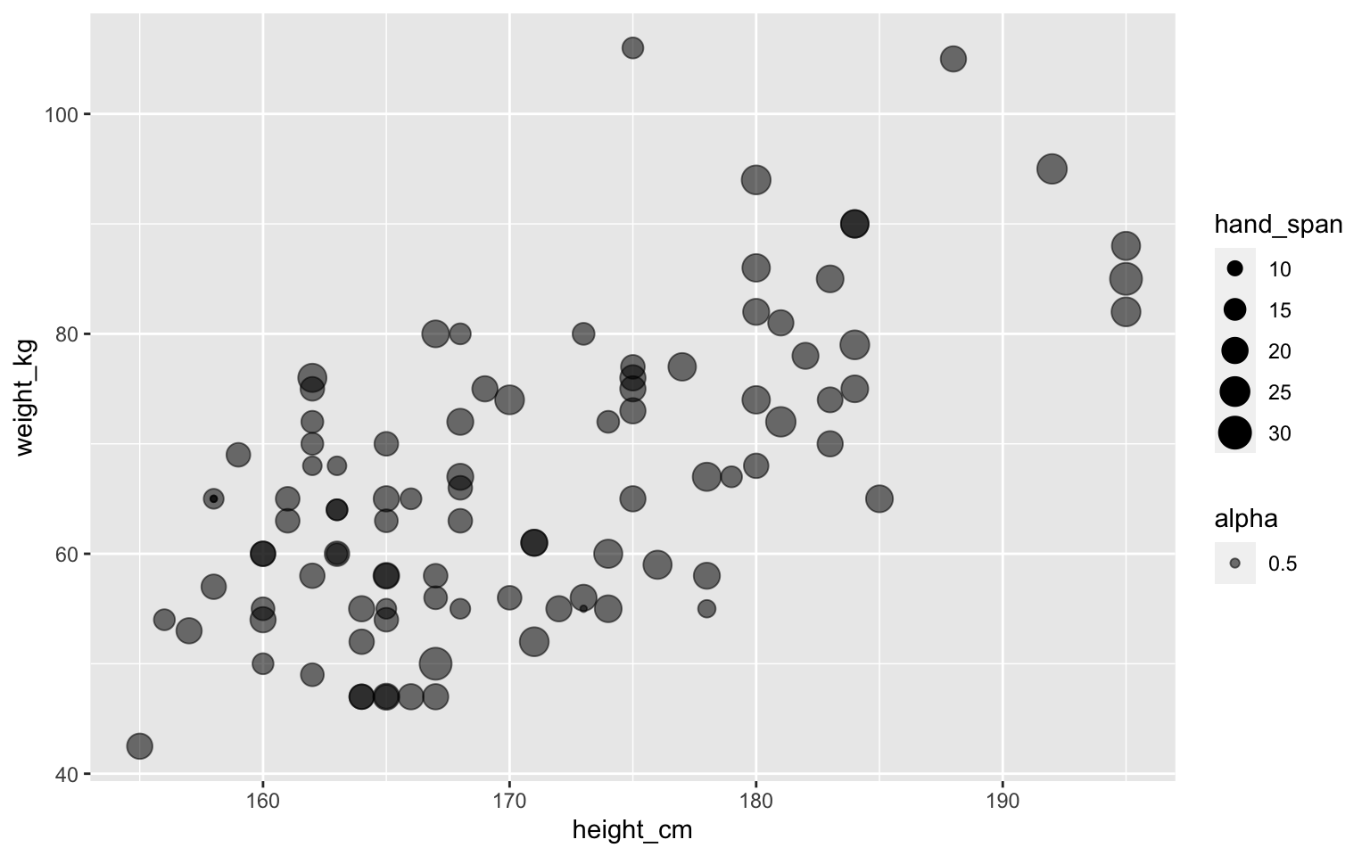
Point size can show some data
Transparent points using alpha
We can put aesthetics in geom_point()
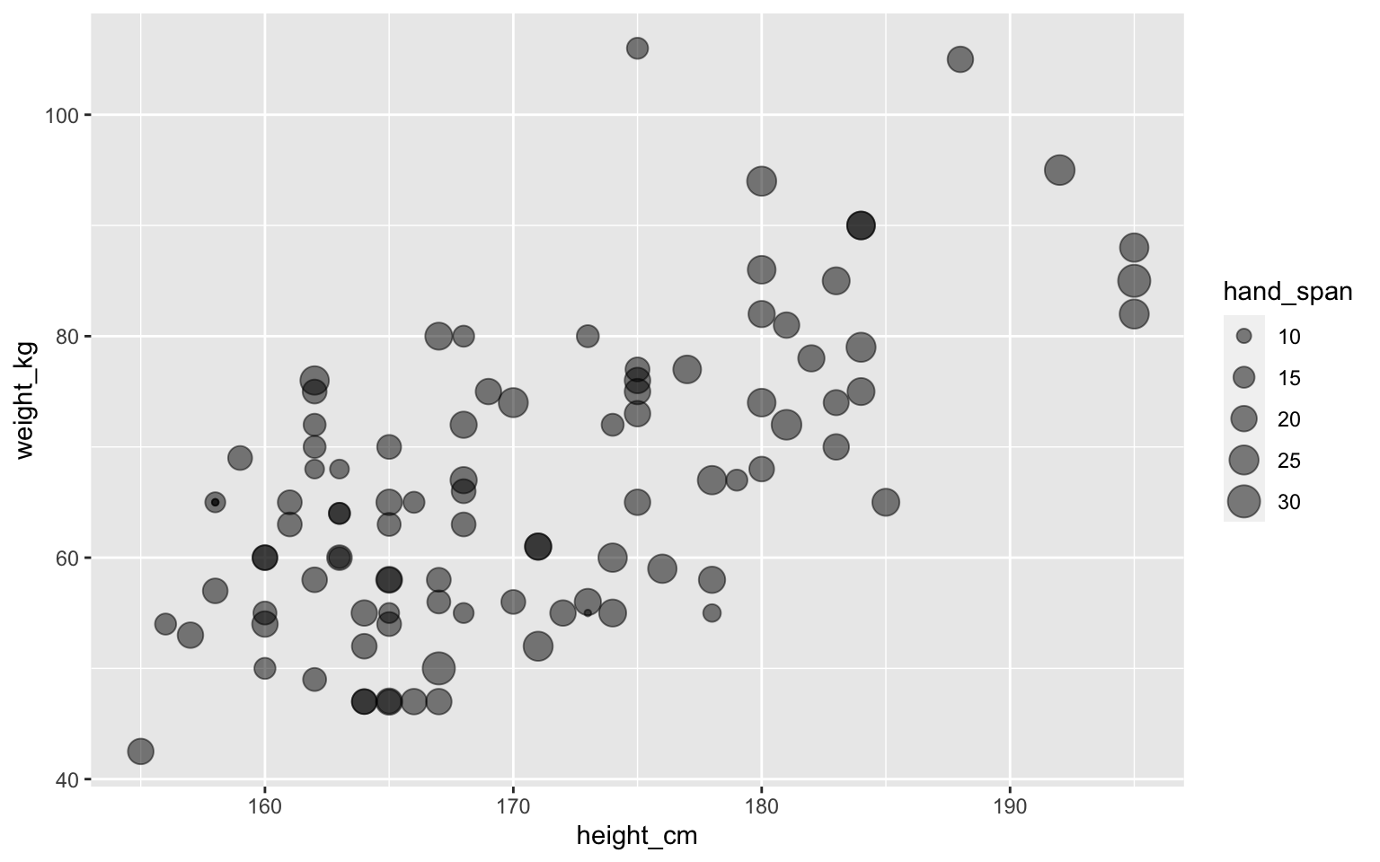
Assigning multiple aesthetics
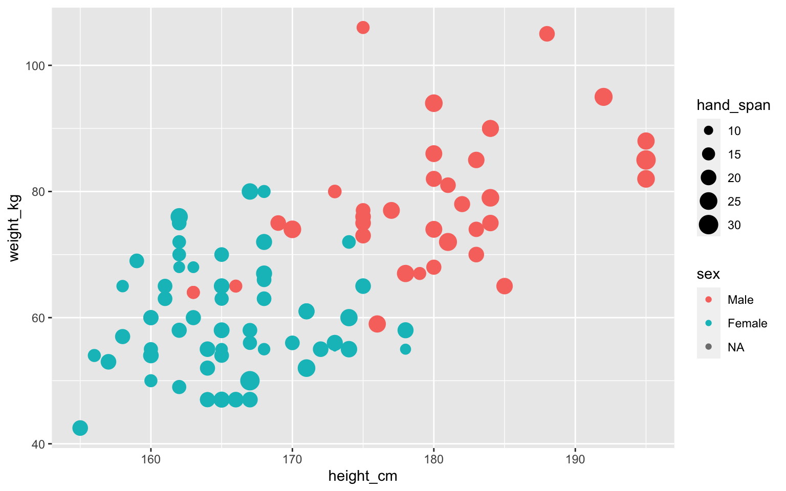
Some shapes have color and fill
ggplot(students, aes(x=height_cm, y=weight_kg,
                        size=hand_span, fill=sex)) +
  geom_point(alpha=0.5, shape="circle filled", color="black")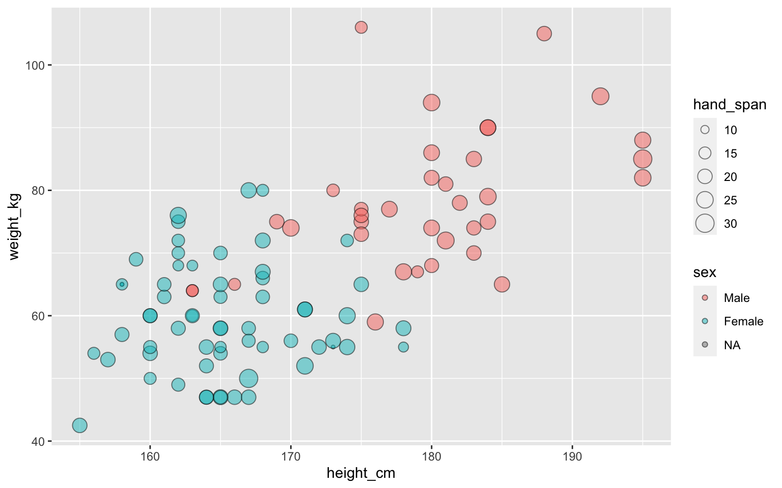
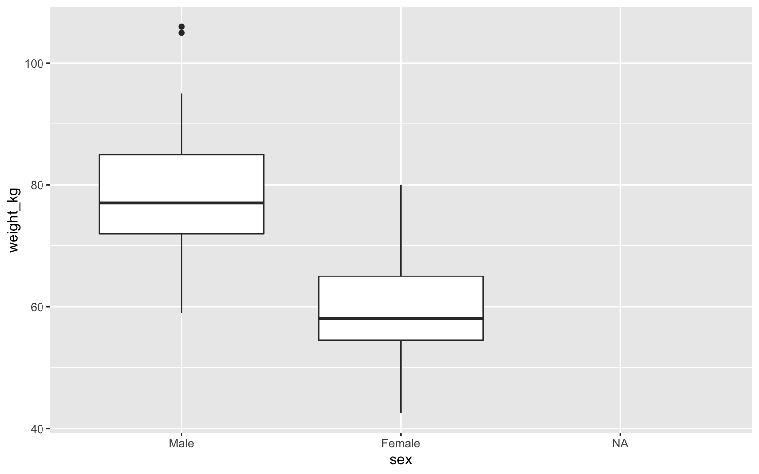
Boxplot
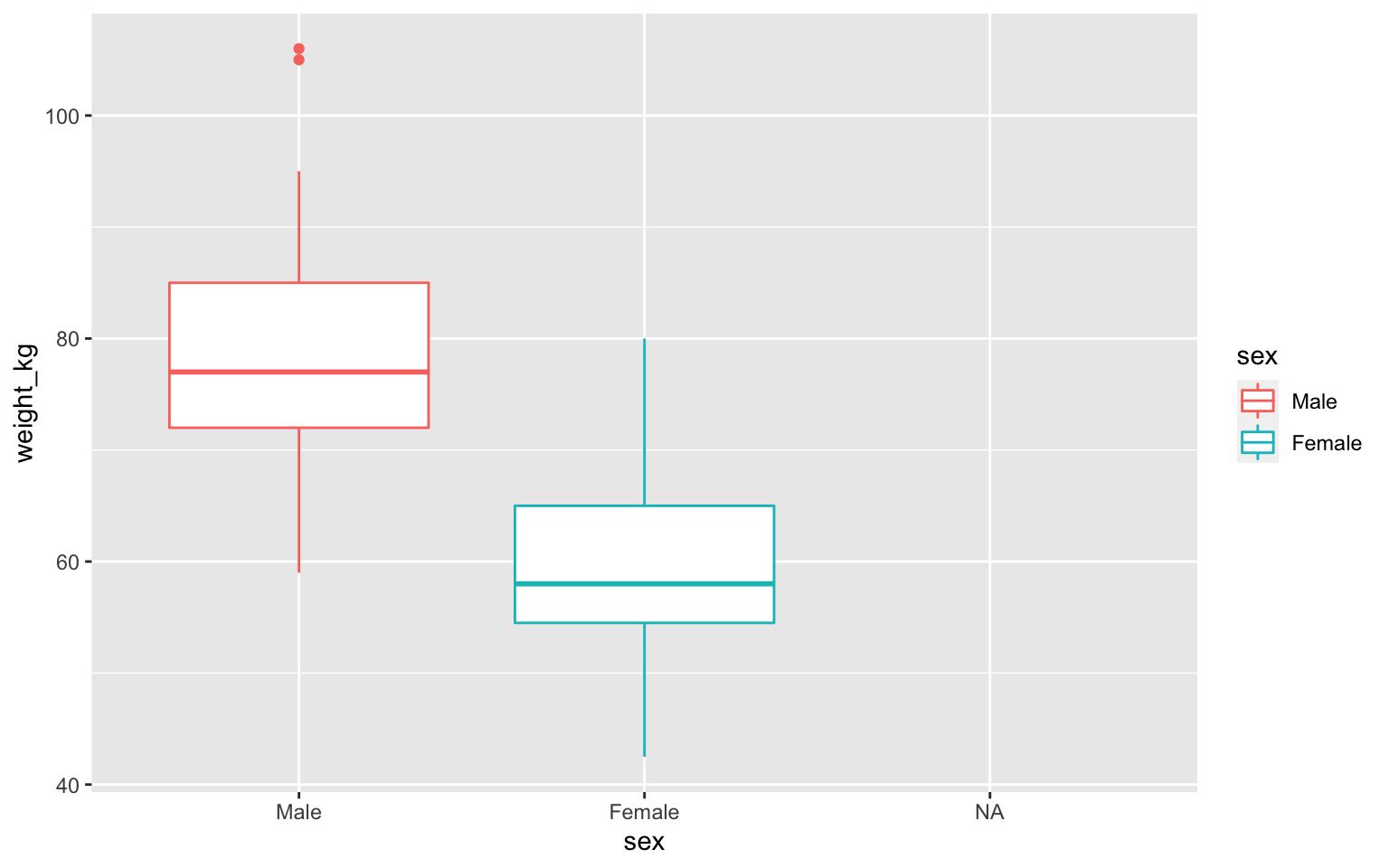
Boxplot with color
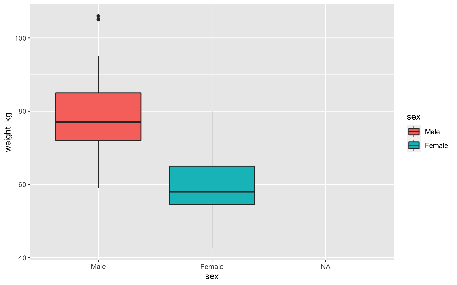
Boxplot with fill
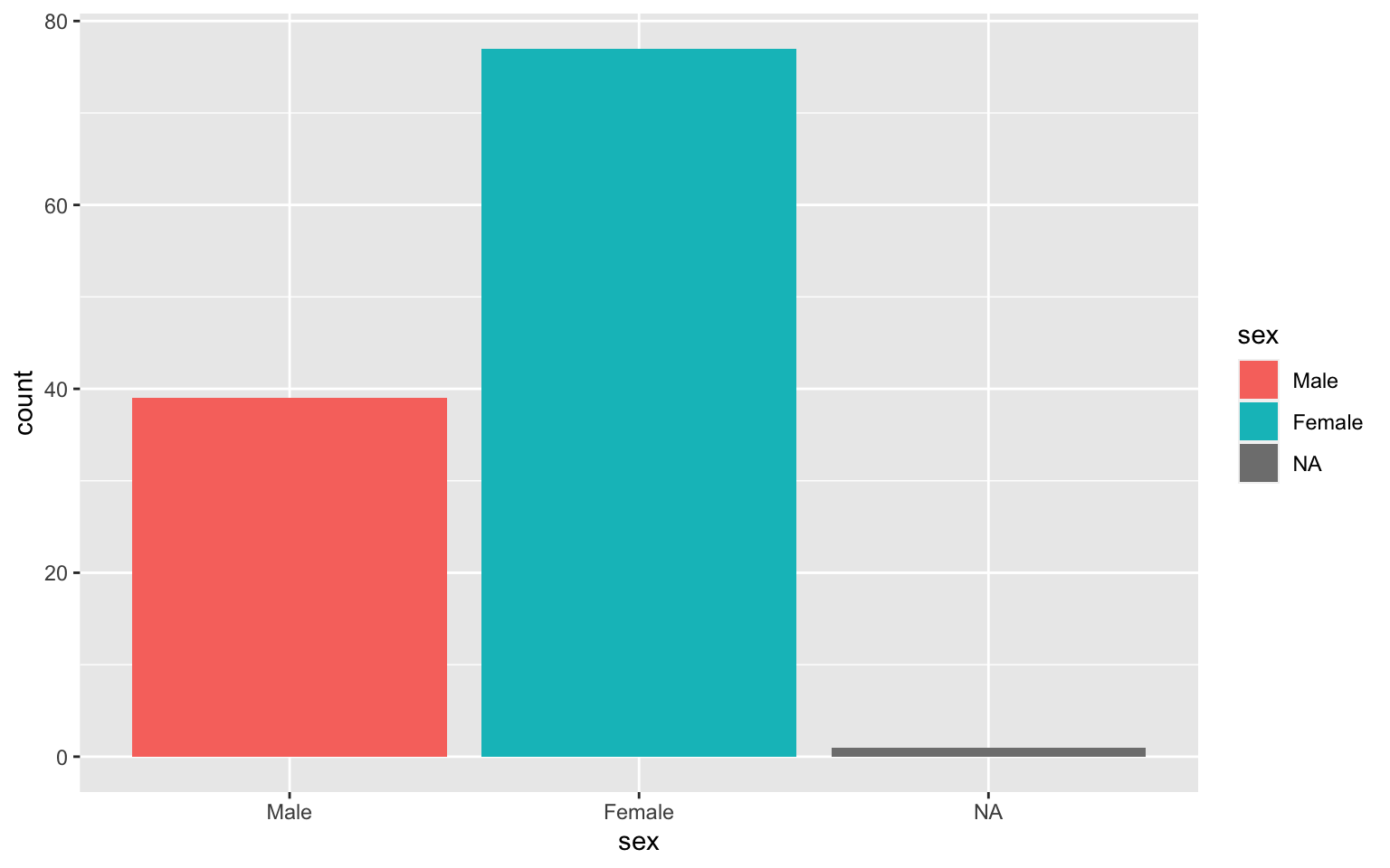
Barplot counts values in one column
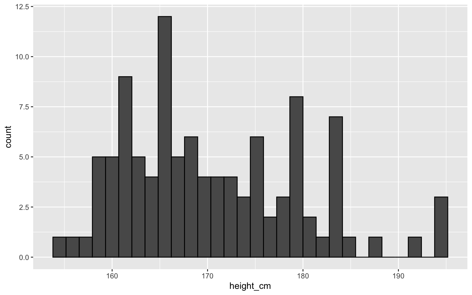
Histogram for numeric variables
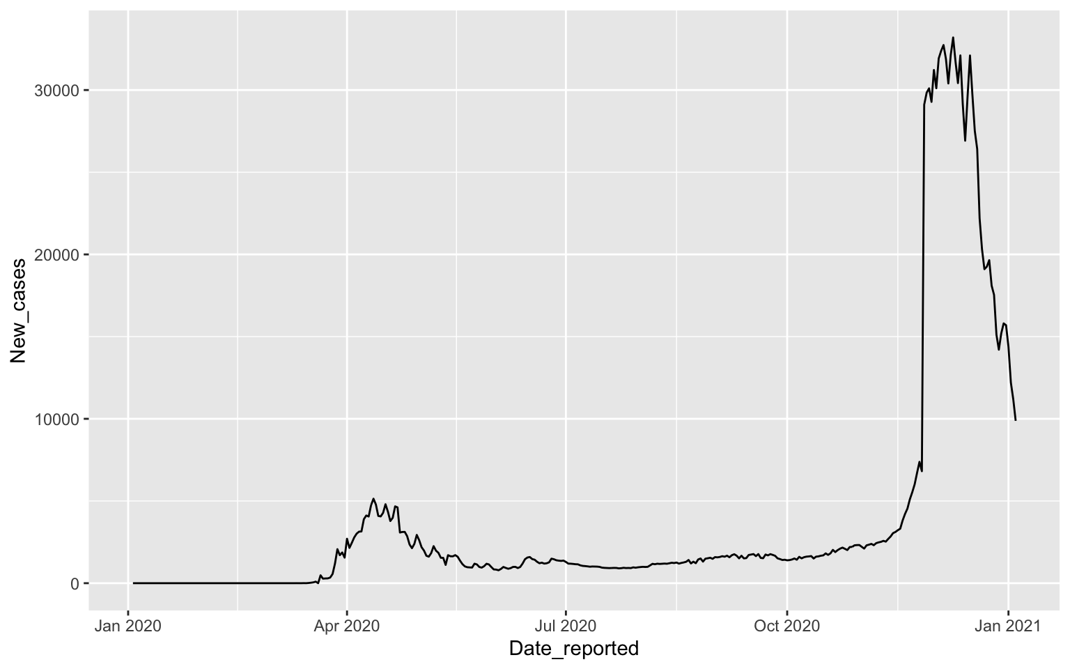
COVID-19 cases depend on time
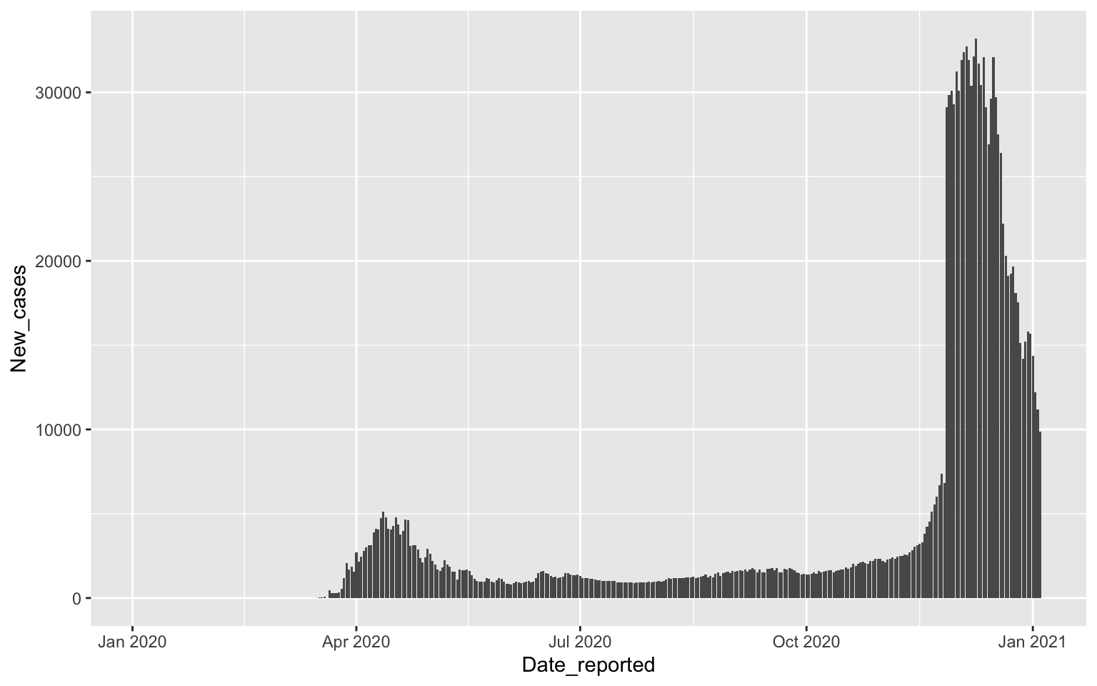
Drawing columns
Focusing on April
Turkey %>%
    filter(Date_reported>"2020-03-31", Date_reported< "2020-05-01") %>%
    ggplot(aes(x=Date_reported, y=New_cases)) + geom_col()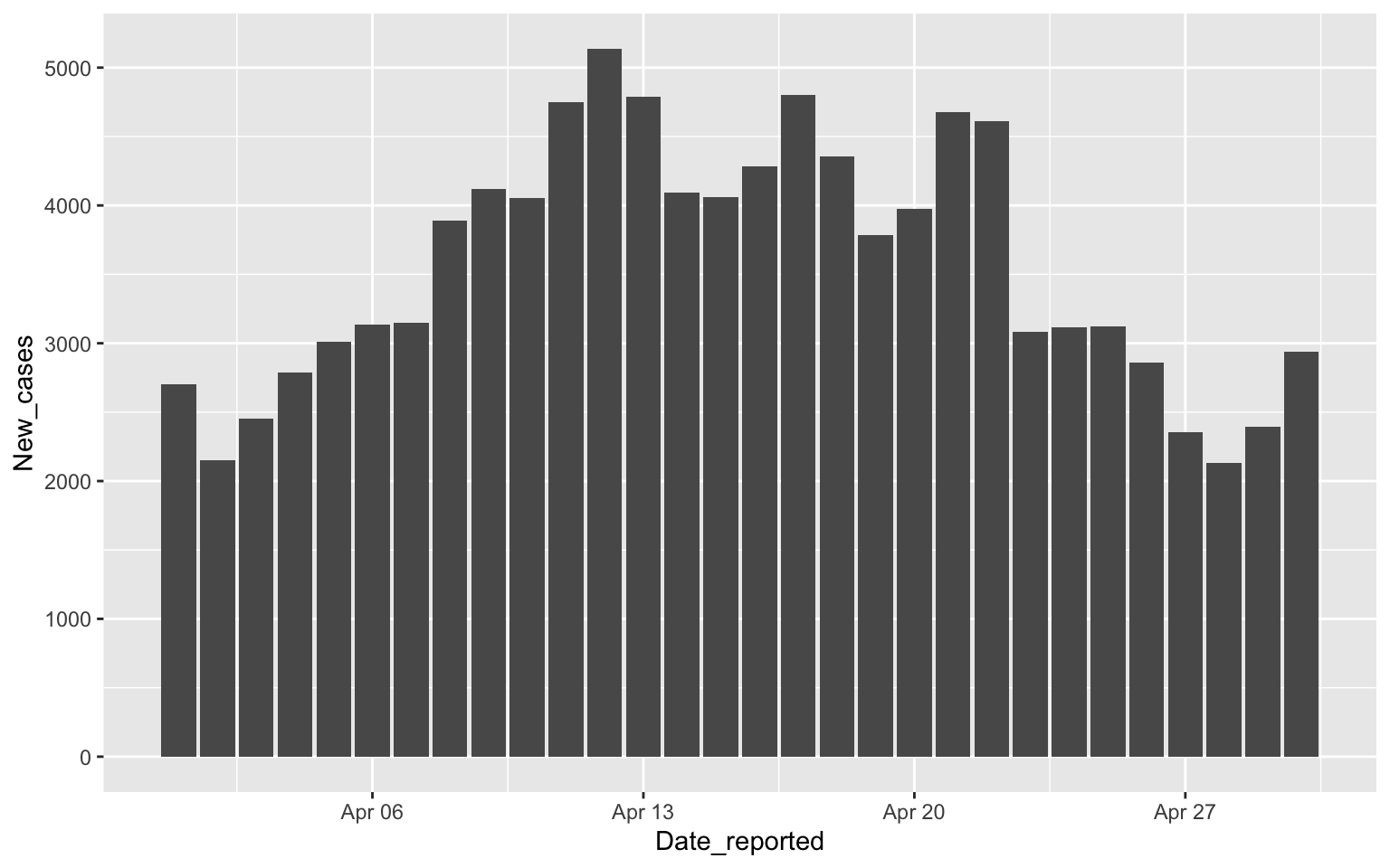
Drawing all European Countries
covid %>% filter(WHO_region=="EURO") %>%
    ggplot(aes(x=Date_reported, y=Cumulative_cases, color=Country)) +
    geom_line()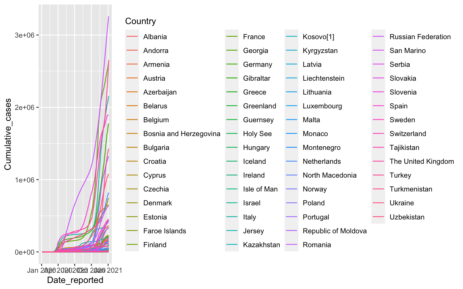
South East Asia
covid %>%
    filter(WHO_region=="SEARO") %>%
    ggplot(aes(x=Date_reported, y=New_cases, color=Country)) +
    geom_line()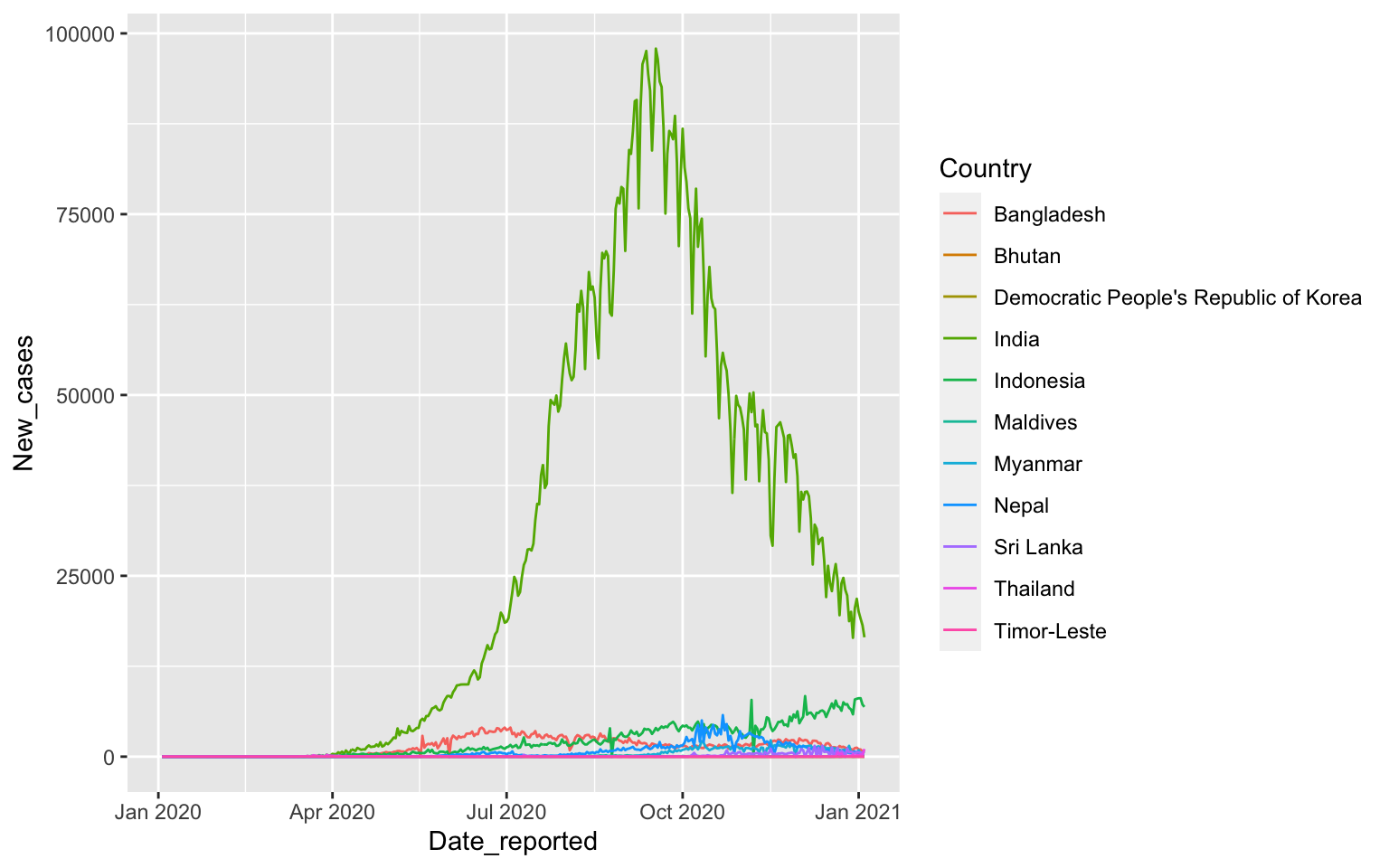
South East Asia in April
covid %>% filter(WHO_region=="SEARO") %>%
    filter(Date_reported>"2020-03-31", Date_reported< "2020-05-01") %>%
    ggplot(aes(x=Date_reported, y=New_cases, color=Country)) +
    geom_line()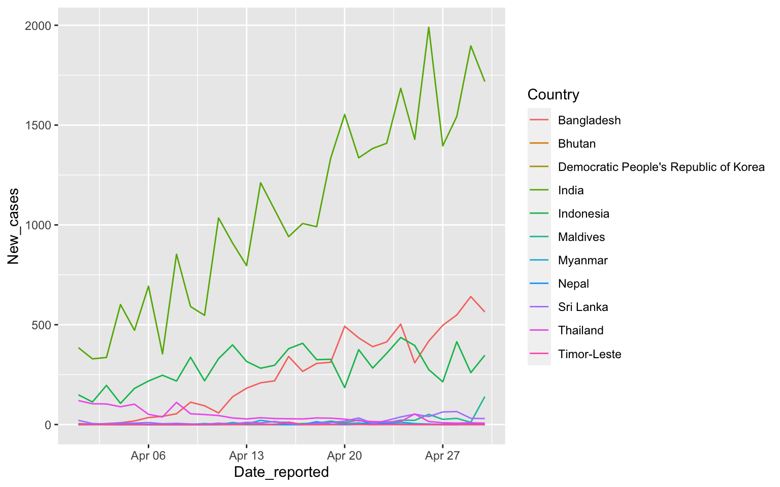
South East Asia with columns
covid %>% filter(WHO_region=="SEARO",
    Date_reported>"2020-03-31", Date_reported<"2020-05-01") %>%
    ggplot(aes(x=Date_reported, y=New_cases, color=Country)) +
    geom_col()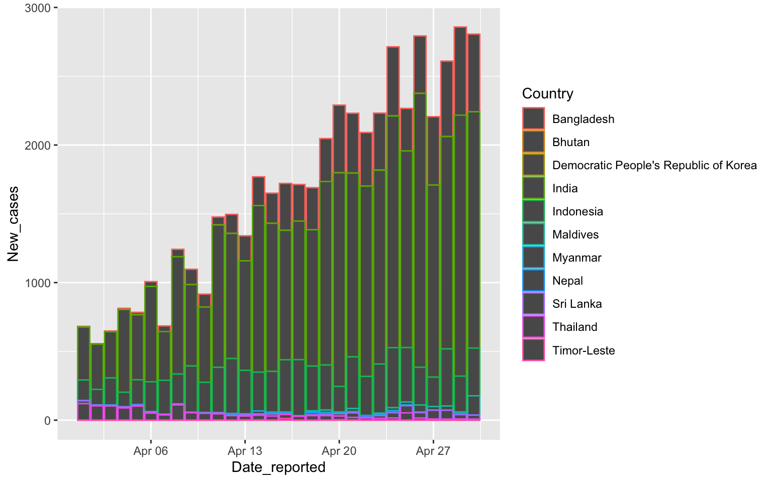
Columns have color and fill
covid %>% filter(WHO_region=="SEARO",
    Date_reported>"2020-03-31", Date_reported< "2020-05-01") %>%
    ggplot(aes(x=Date_reported, y=New_cases, fill=Country)) +
    geom_col()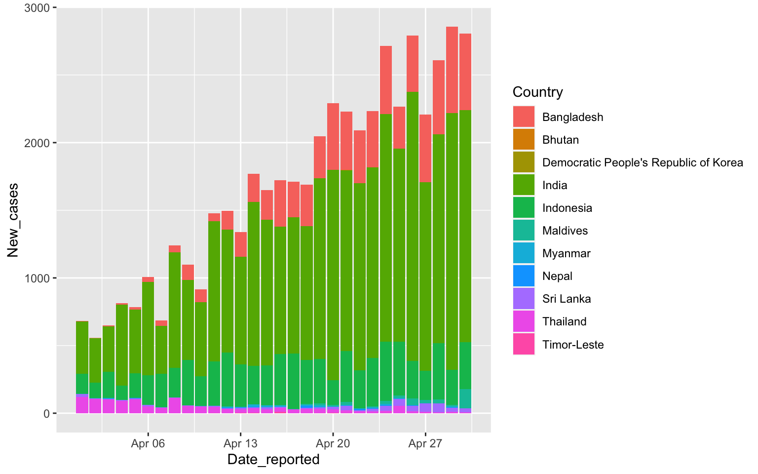
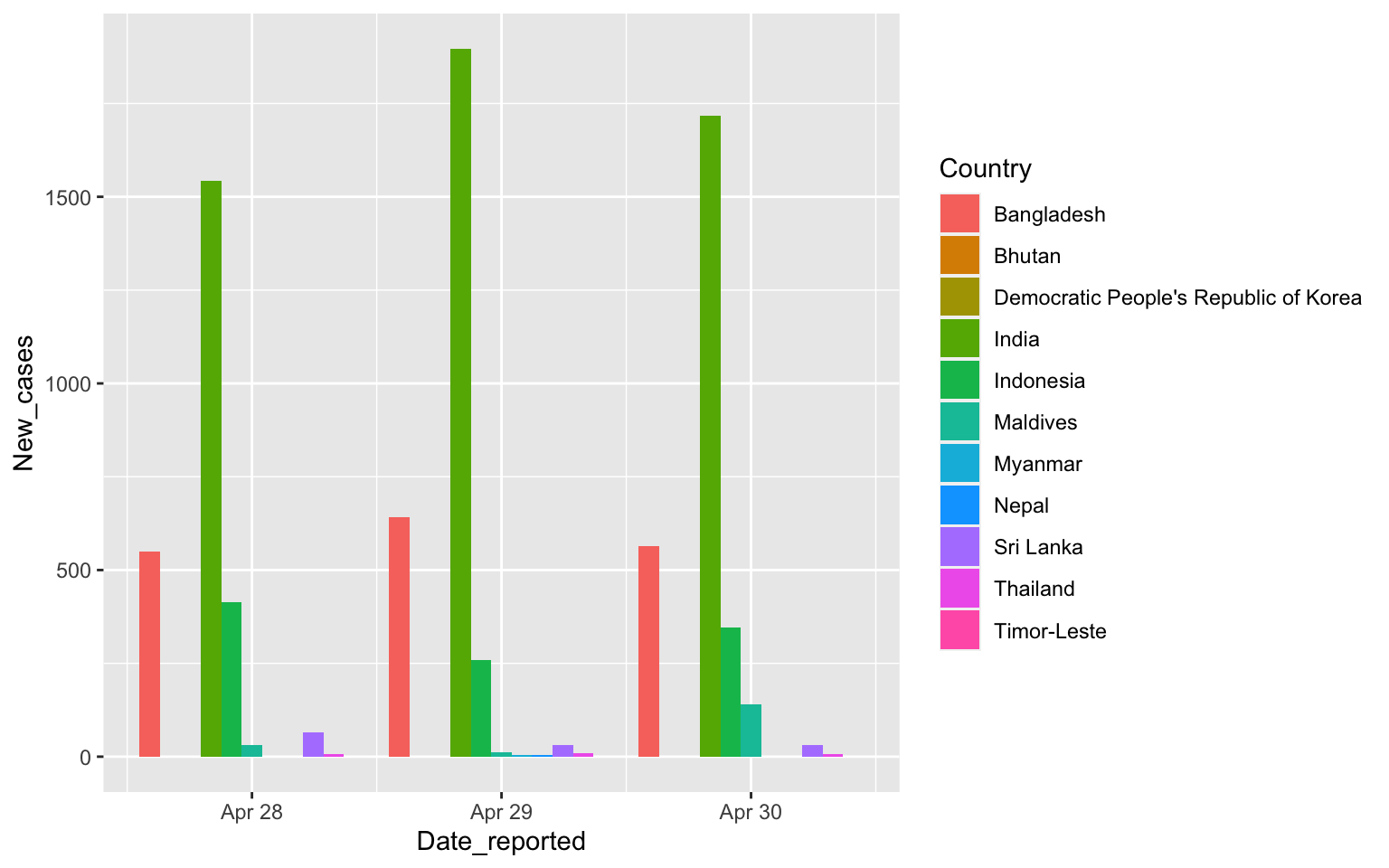
Putting Columns side to side
covid %>% filter(WHO_region=="SEARO",
    Date_reported>"2020-04-27", Date_reported< "2020-05-01") %>%
    ggplot(aes(x=Date_reported, y=New_cases, fill=Country)) +
    geom_col(position=position_dodge())