Final Exam – with Answers
Computing in Molecular Biology and Genetics I
Prepared by Dr. Andres Aravena
January 3rd, 2018
Today we are going to analyze the relationship between the population of each country (the number of people living there), the gross domestic product per capita (GDP, the average income of each person in US dollars) and the life expectancy (the average length of life, in years). The data was produced by the well known research institute Gapminder, and is in a data frame called world2007.
In this document the plots are side by side to save paper. If possible try to do the same in your answer, but it is not mandatory. All plots have the same contribution to the total grade. Each question’s value is shown in parenthesis. There are 15 points in total.
If you do not remember logarithmic scales you can use normal scales (with less grade), or you can read the manual.
1 The world in 2017 (2)
Different countries have very different populations, so it is hard to visualize using a linear scale. It is better to analyze the logarithm (in base 10) of the population. Please draw two histograms with grey color and including a main title. The fist histogram shows the population, the second one shows log10() of the population.
par(mfrow=c(1,2)) # this is 1 point
# histogram 3 points, +1 color, +1 main title
hist(world2007$population, col="grey", main="World Pop")
# log 3 points, +1 log10, +1 color, +1 main title
hist(log10(world2007$population), col="grey", main="log10(World Pop)") 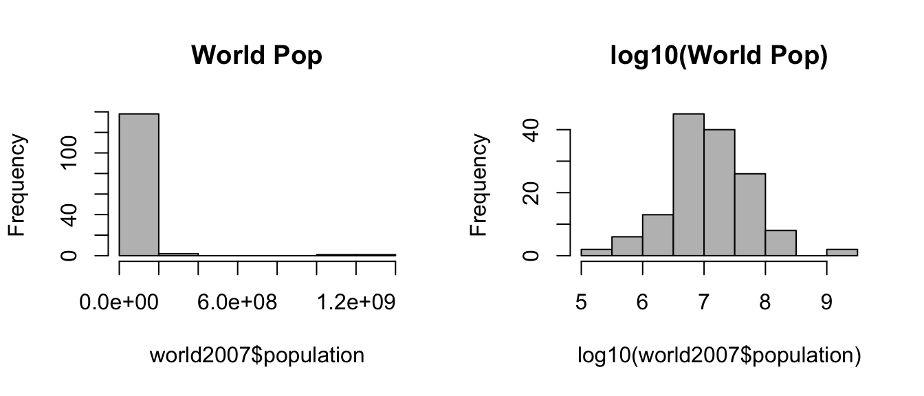
2 The continents are different (3)
Please draw three separate boxplots using data from world2007. The first must show the life expectancy depending on the continent, the second shows the GDP per capita and the third shows the population. Notice that the first two boxplots use linear scale but the last one uses a logarithmic scale.
par(mfrow=c(1,3)) # 1 point
# plot 3 points, +2 main title
plot(life_exp ~ cont, data=world2007, main="Life Expectancy")
# plot 3 points, +2 main title
plot(gdp_cap ~ cont, data=world2007, main="GRP per capita")
# plot 3 points, +2 main title +2 log scale
plot(population ~ cont, data=world2007, main="Population", log="y") # log scale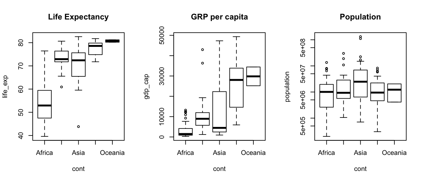
3 Each continent has different life expectancy (1)
Please plot the following graphic, showing the relationship between continent and life expectancy.
plot(cont ~ life_exp, data=world2007, main="Continent v/s Life Expectancy")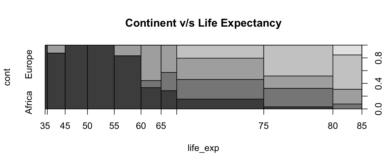
4 Life expectancy depends partially on GDP per capita (3)
Please prepare three plots showing life expectancy depending on GDP per capita. The first plot uses linear scale. The second and third plots use log-log scale. All use the option pch=21 for the plot character. For the last plot, the symbol size (cex=) should change with the population. Please create a new column called world2007$lpop with the value log10(world2007$population)-5 and use it to change the symbol size on the third plot.
par(mfrow=c(1,3)) # 1 point
# plot 1 point, +1 pch=21
plot(life_exp ~ gdp_cap, data=world2007, pch=21) # plot:4 pch:1
# plot 2 points, +3 log scale, +1 pch=21
plot(life_exp ~ gdp_cap, data=world2007, pch=21, log="xy")
# assingment 2 points
world2007$lpop <- log10(world2007$population)-5
# plot 1 point, +1 pch=21, +1 cex=lpop, +2 log scale
plot(life_exp ~ gdp_cap, data=world2007, pch=21, log="xy", cex=lpop)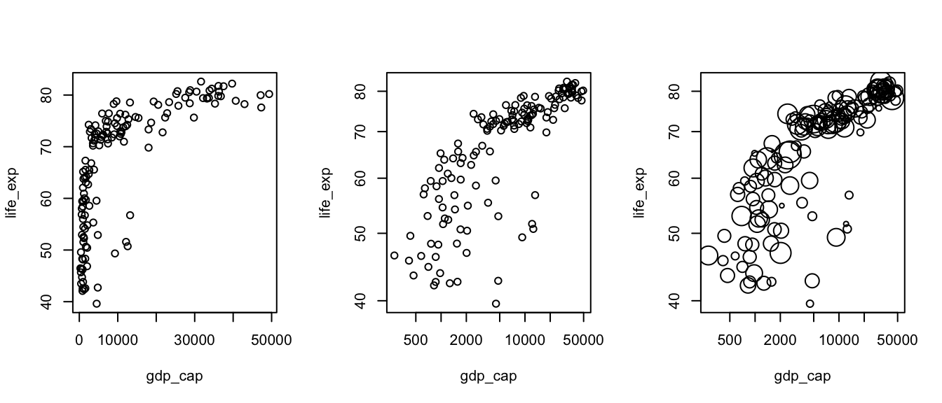
5 Real data and model (3)
Now we will do the final graphic including a linear model. Please create a linear model, called model, to find the relationship between the life expectancy and the GDP per capita in the logarithmic scale. Then plot life expectancy depending on GDP per capita with logarithmic scales, using character size equal to lpop and background color (bg=) depending on the continent. After the plot add points with the prediction of the model using pch=23 and background color “yellow”. Do not forget the legend, title and labels.
# any model 2 points, +1 log(life_exp), +1 log(gdp_cap)
model <- lm(log(life_exp) ~ log(gdp_cap), data=world2007)
# +1 bg=cont, +1 pch=21, +1 main, +1 xlab, +1 ylab
plot(life_exp ~ gdp_cap, data=world2007, log="xy", cex=lpop,
     pch=21, bg=cont, main="The world at 2007", xlab="GDP per capita",
     ylab="Life Expectancy")
# +1 points, +1 predict(...), +1 exp(...), +1 bg="yellow", +1 pch=23
points(exp(predict(model))~gdp_cap, data=world2007, bg="yellow", pch=23)
# +1 legend(...), +1 "topleft", +1 legend=, +1 fill
legend("topleft", legend=levels(world2007$cont), fill=1:5)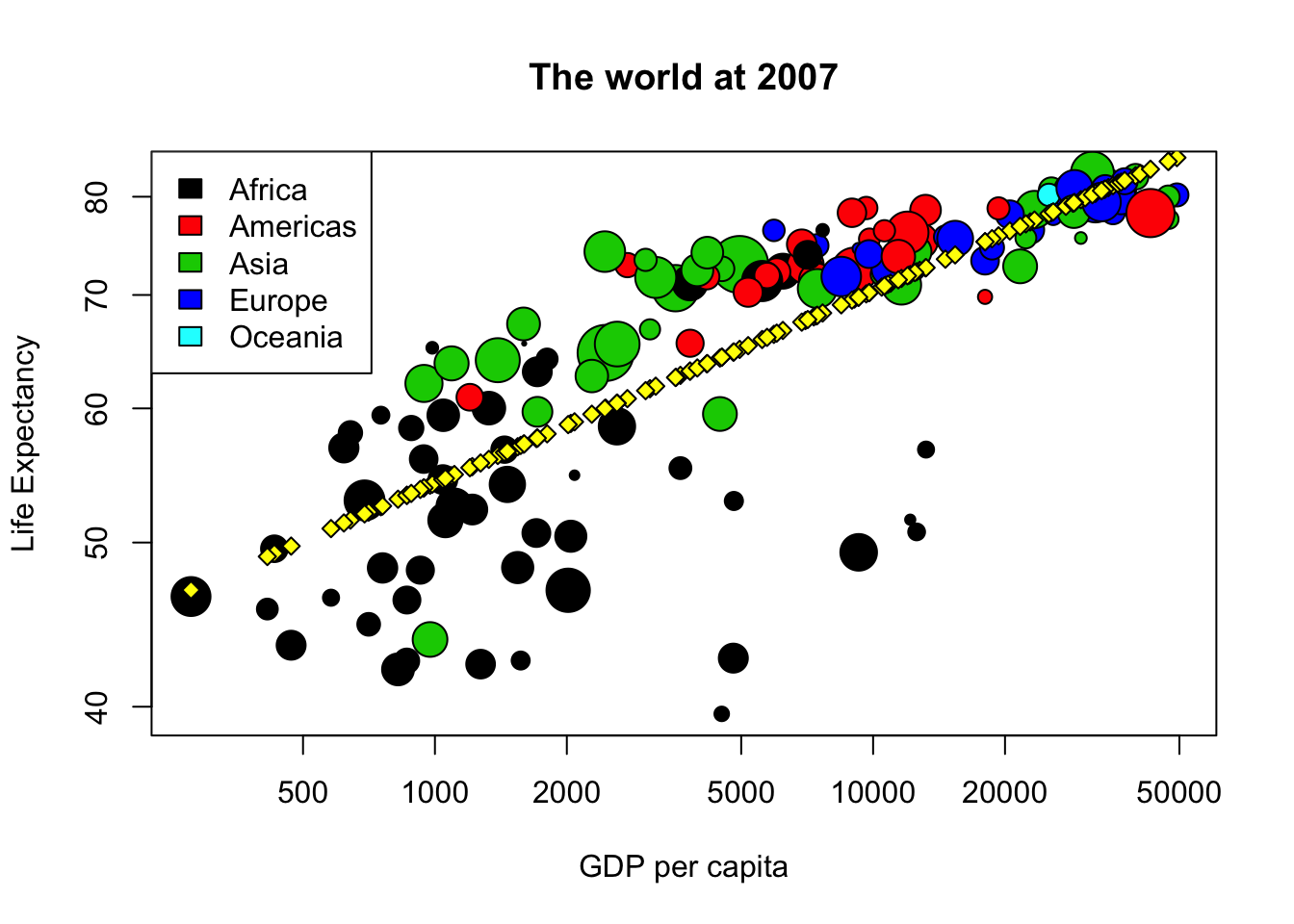
6 Prediction (1)
Since we have a model for the average life expectancy depending on GDP per capita, we can use it to predict. Please create a data frame called yeni_data with a column called gdp_cap. The values of gdp_cap are 1000, 2000, 5000, 10000, 20000. Use model and yeni_data to predict the life expectancy. Put the predicted vaule on yeni_data$life_exp and show the table. Hint: sometimes you need to use exp(), sometimes you do not need.
# +1 yeni_data <- data.frame(...), +1 gdp_cap=c(...)
yeni_data <- data.frame(gdp_cap=c(1000, 2000, 5000, 10000, 20000))
# +1 assignment, +1 predict(...) +1 newdata=, +1 exp(...)
yeni_data$life_exp <- exp(predict(model, newdata=yeni_data))
# +1 showing yeni_data, +1 knitr::kable()
knitr::kable(yeni_data)| gdp_cap | life_exp |
|---|---|
| 1000 | 54.21237 |
| 2000 | 58.64676 |
| 5000 | 65.07019 |
| 10000 | 70.39271 |
| 20000 | 76.15059 |
# max score=6 7 Model with interactions (1)
Since continents are so different, we can create a new linear model, called model2, with a formula where the logarithm of life expectancy depends on the continent, the interaction of the continent and the logarithm of the population, and without a constant “intercept”. Please write the code to create model2. Then you can draw again the same plot as in question 5 (copy and paste the code) and add points with the prediction of model2.
# +2 log(gdp_cap):cont, +2 "+cont"", +1 "+0""
model2 <- lm(log(life_exp) ~ log(gdp_cap):cont + cont + 0, data=world2007)
# plot is the same as Q06, does not give points
plot(life_exp~gdp_cap, data=world2007, log="xy", cex=lpop, pch=21, bg=cont,
     main="The world at 2007", xlab="GDP per capita", ylab="Life Expectancy")
points(exp(predict(model2))~gdp_cap, data=world2007, bg="yellow", pch=23)
legend("topleft", legend=levels(world2007$cont), fill=1:5)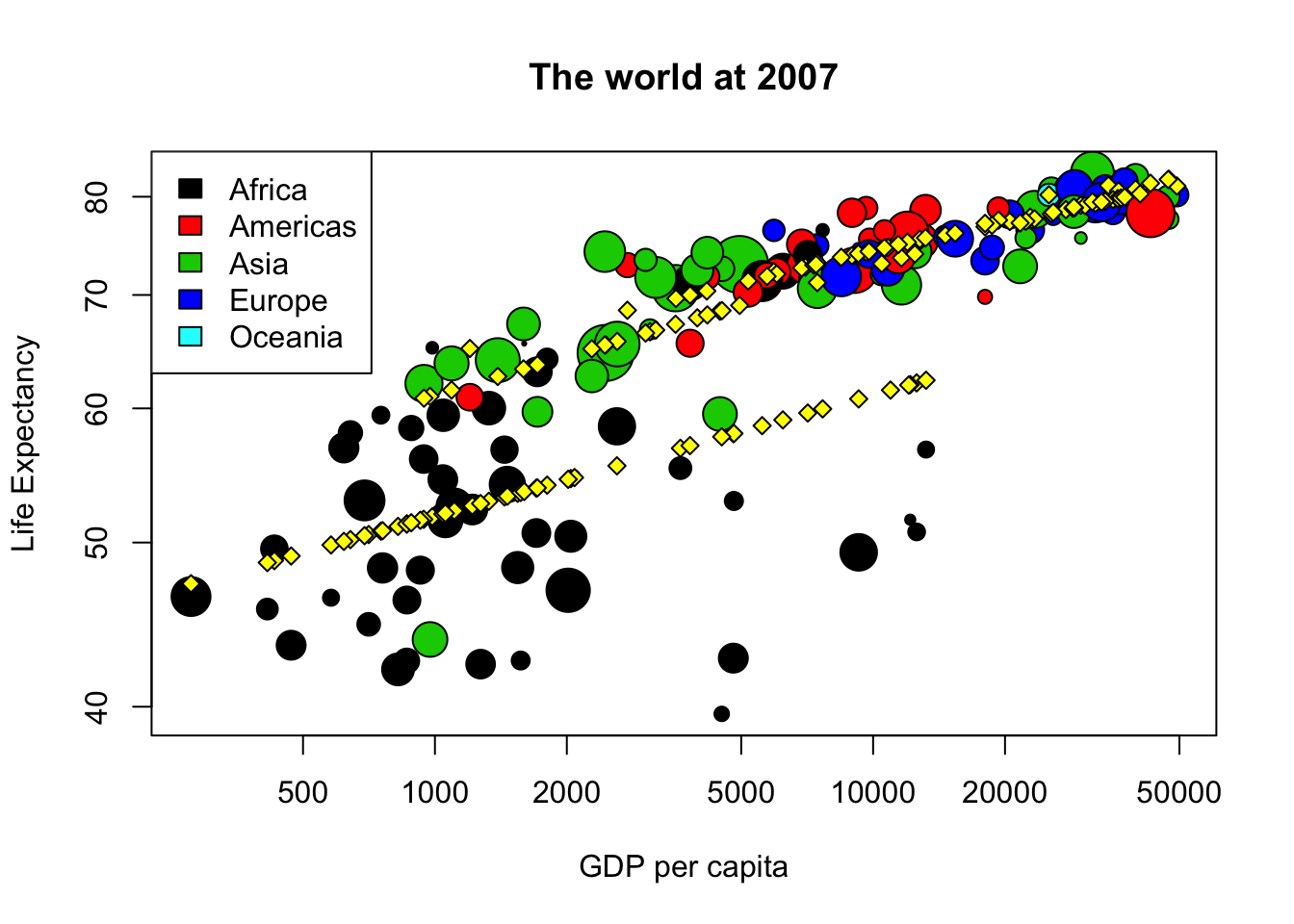
# Initially this question had 12 points, but half the question is the same
# as the previous one, so we only evaluated the first half. This was better for
# most of the students