Class 11
Andres Aravena, PhD
15 November 2016
Analyzing data from US states
In our system we have some variables describing US states. They are:
state.abbstate.areastate.centerstate.divisionstate.namestate.regionstate.x77
We want to give good descriptions of this data.
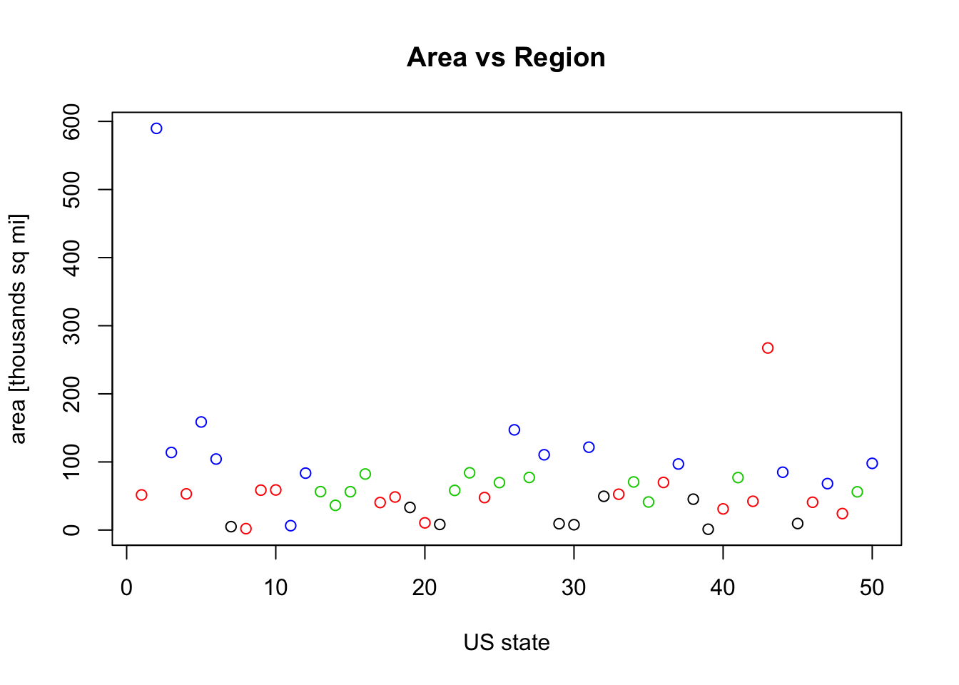
Area versus Region
Initially we can make this simple graphic
plot(state.area, col=as.numeric(state.region))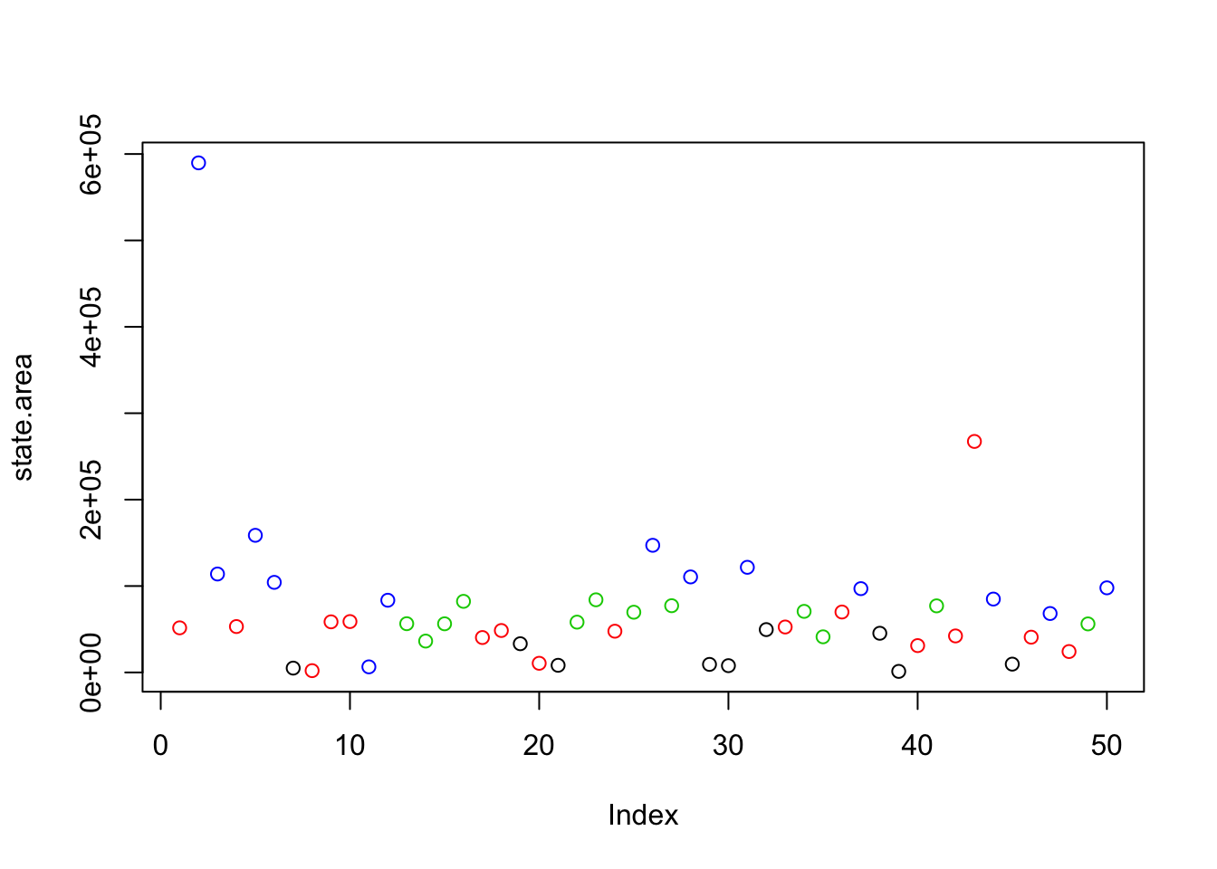
We want to add
- main title
- labels on the axis
- change numbers on the vertical axis
- include a legend explaining the symbols
Here we put a main title
plot(state.area, col=as.numeric(state.region), main="Area vs Region")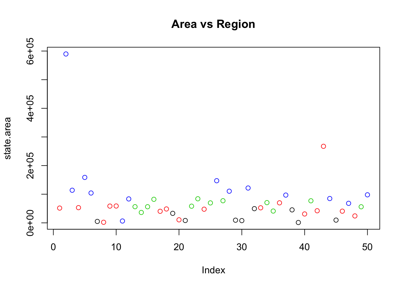
then we add labels to the axis
plot(state.area, col=as.numeric(state.region), main="Area vs Region", ylab="area [sq mi]", xlab="US state")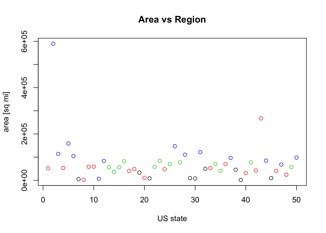
then we changed the units of the vector
plot(state.area/1000, col=as.numeric(state.region), main="Area vs Region", ylab="area [thousands sq mi]", xlab="US state")